Concept and Manifestation in Lars Wander’s Rhythm & the Machine

Lars Wander explores the relationship between chaos and ordered systems in his latest series Rhythm & the Machine.
“Wait, what is the art here?”
What are the boundaries of authorship? Must an artist hold the paintbrush to be the creator?
American artist Sol Lewitt famously challenged us to confront these questions in his series of wall drawings that existed only as unrealized designs in the form of a contract with specific implementation instructions. The realized design, the actual drawing on the wall, did not exist until the contract owner hired a team to translate the instructions into its manifested physical state. Lewitt did not physically participate in the application of the instructions on the wall.
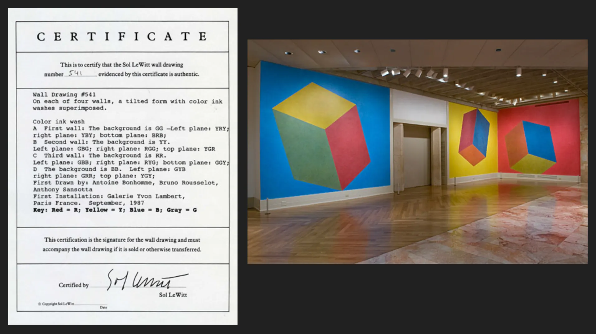
Sol LeWitt Wall Drawing #541 after its 2009 reinstallation Photo by Travis Fullerton © Virginia Museum of Fine Arts
Suddenly the age-old question of “Who made this?” was no longer synonymous with “Who is the artist?” Audiences were forced to think about what constitutes art: the concept or its execution? Was the paint on the wall the art? The instructions? Both? Neither?
Inevitable Questions
Generative art existed before Lewitt and continues in many forms today, from performance art to algorithmic, code based art. If the concept and manifestation are overtly captured in two distinct artifacts of instruction and manifestation, it is generative.
Lewitt overtly embraced the questions about the art form as part of his work. This is not true of most generative art. The focus of the work is often elsewhere, and its generative nature is simply what it is. But even when the subject of a work is not contemplating the nature of generative art, many works evoke the questions anyway.
Multiple Manifestations in Rhythm & the Machine
Rhythm & the Machine is a code-based generative work with three distinct manifestations: 2 digital and one physical. Its instructions are encapsulated in 1,290 lines of code that generate two paired digital images, one of which is then further translated into a mixed media silk screen.
It does not provoke questions about the separation of concept and manifestation like Lewitt. It assumes that those questions have been satisfied and then uses that flexibility to explore the relationship between chaos and ordered systems.
One of the images shows us what looks like viscous ink, seemingly perturbed and mixed at random on the surface of water. The second image — the ‘instruction layer’ — gives us a peek behind the scenes at the underlying components of the algorithmic system that created the final output: Regular geometric shapes that were distorted by arrows of varying directions and force.
This ‘instruction’ layer reminds us that chaos is in fact rooted in ordered systems. We can see the before and the after of the directional forces, how regular shapes became a seemingly random abstract color field.
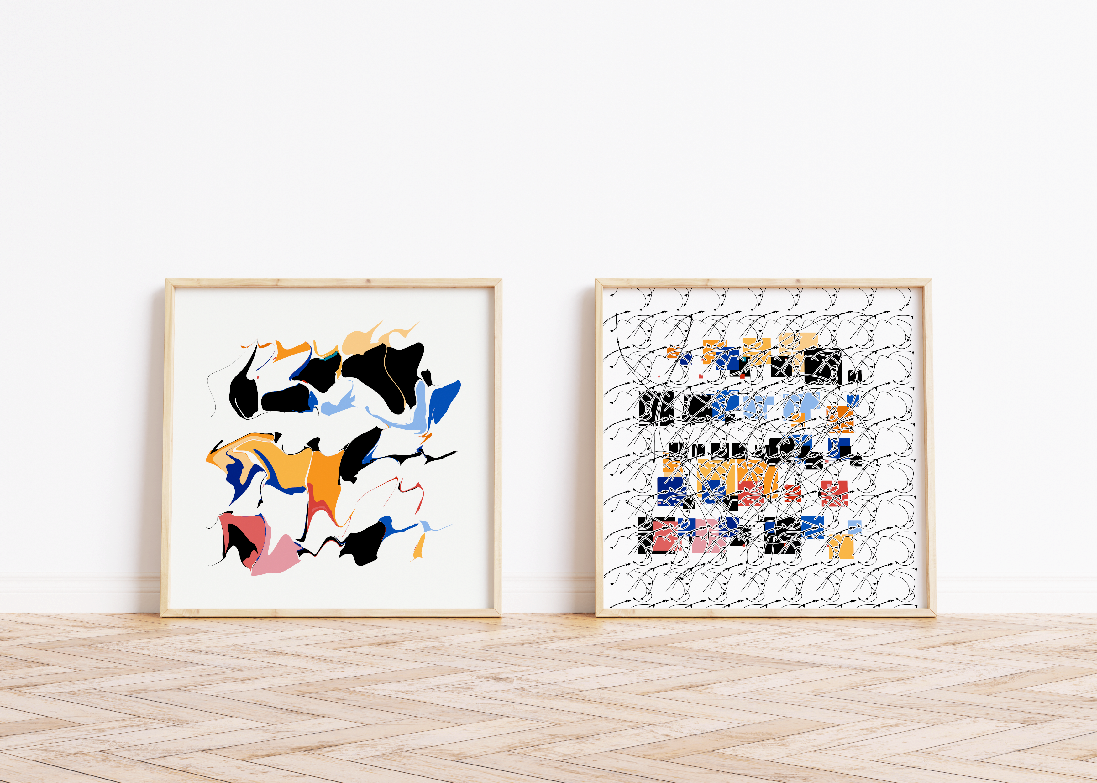
Lars Wander, Rhythm & the Machine #185 (2023)
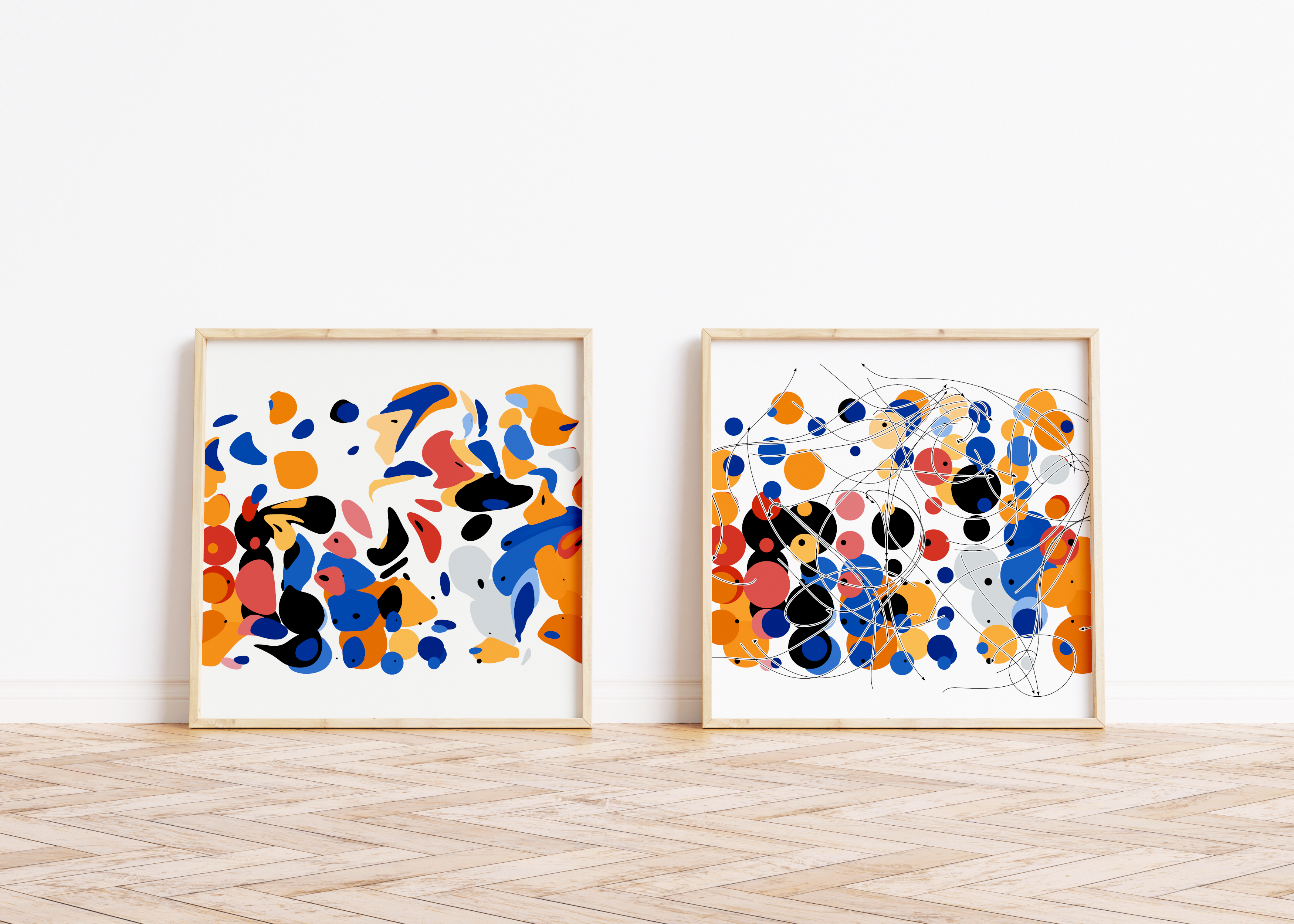
Rhythm & the Machine #374 (2023)
The instruction layer evokes Andy Warhol’s Dance Diagram series, where Warhol traced dance patterns from an instruction book and then oriented them vertically as art, inviting the viewer into the art work, and asking them to participate.
Critics who have reviewed Dance Diagram noted that unlike paintings of typewriters or phones, the work inspires viewers to begin moving, to participate. The same is true of exhibitions similar to Rhythm & the Machine. Viewers reach out with their index fingers to try and recreate the perturbation in the final image.
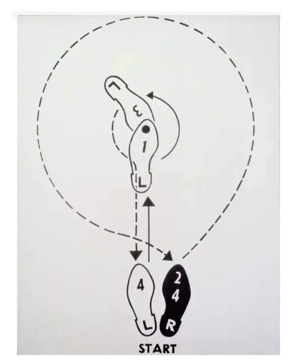
Andy Warhol, Dance Diagram [3] [THE LINDY TUCK-IN-TURN-MAN] (1962)
© The Andy Warhol Foundation for the Visual Arts/Artists Rights Society (ARS), New York
Like Dance Diagram, the instruction layer is both the potential for movement and a record of the movement. It is not an a priori instruction layer. The actual instructions are in the code. The image itself is an output that is generated in parallel with the completed image. Even though it prompts us to take action, those “instructions” are a convenient fiction that help us understand what is happening.
The elevation of that moment, the invitation to trace the paths of distortion, is where we realize that a seemingly chaotic image is the result of an ordered system, and it makes us wonder what true chaos is. Is true standalone chaos possible? Or is it always tied back inevitably to an ordered system of some kind?
Mixed Media Silk Screen & Translation Layers in Rhythm & the Machine
All generative art has at least one translation layer as the work passes from one state to another. In the case of Lewitt, a single translation layer sits between the two states of written instruction and the work’s manifestation. In some modern algorithmic generative art, two translation layers exist in between three states: the code, the digital image, and the physical output.
In the physical manifestation of Rhythm & the Machine, Lars Wander layered three distinct printing methods to call our attention to the overt separation of concept and physical form, and to make clear that translation layers create versions of the previous state.
The work is first printed digitally on paper, and then the full print is covered with a varnish. Finally, selected color elements are silk screened over the varnish, creating depth and a semi-glossy finish.
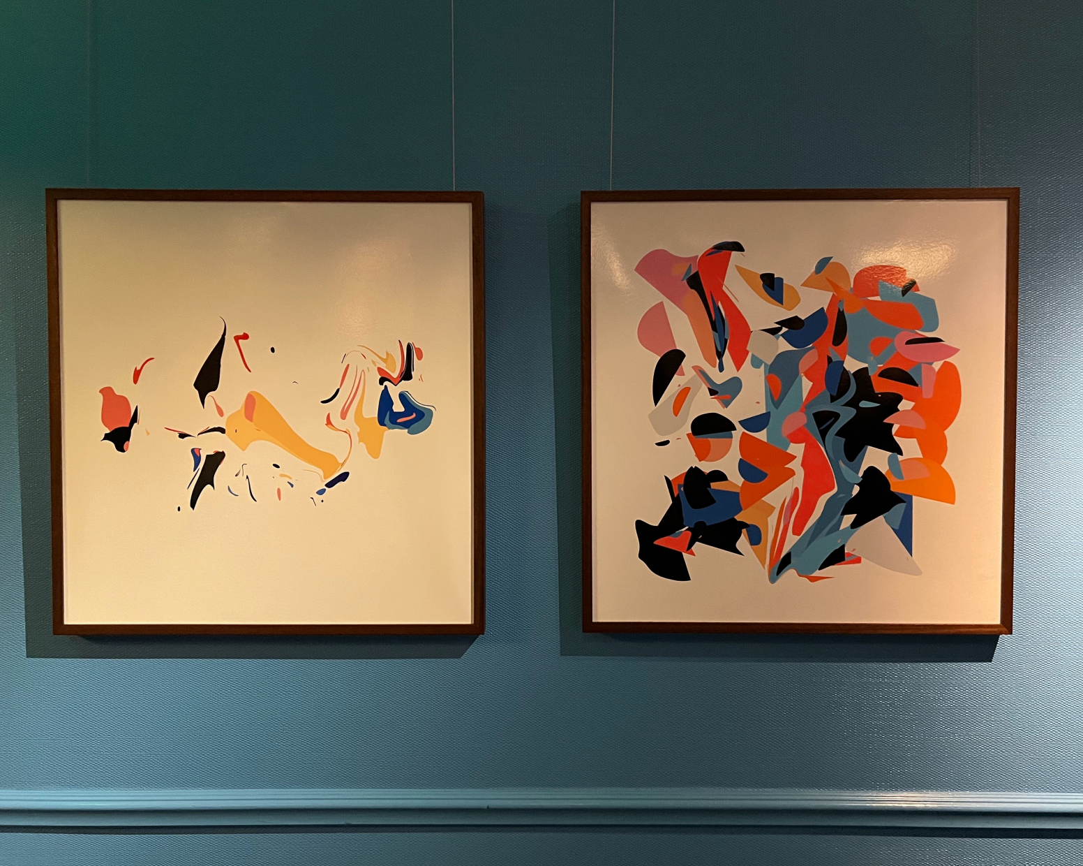
Mixed media silk screen for Rhythm & the Machine by Lars Wander
Color Translation
Wander uses color to explore the translation drift that occurs during passage between states. The origin color palette for the collection comes from the commercially available paint Golden Heavy Body Acrylics. Wander recreated the palette in RGB to allow the digital state of the work to evoke the vibrant and viscous feel of the original paint.
But when the work is then printed digitally, RGB is translated to CMYK formulations. To the casual observer, the colors look the same. But in reality, they have been reformulated and have evolved.
At this point, the colors themselves have gone through two translations (Paint → RGB, RGB → CMYK), with inevitable drift in color fidelity each time.
In the physical state of the work, the varnish, with its reflective properties, reminds us of plasticity and viscosity of original paints. It creates a paint-like aesthetic but doesn’t mask the digital printing that ties the work back to its digital state.
Finally, the silk screen layer broadens its color gamut and brings color fidelity to the artwork that digital printing cannot. Screen printing’s pigment-based inks achieve brighter reds, oranges, blues, and greens than CMYK inks are able to.
The colors for the silk screen are mixed by hand to match the original formulation as closely as possible, and are applied over the varnish in certain areas. The silk screened portions tie us back to the original colors more closely, and also remind us that we are looking at a physical manifestation of a digitally conceived work, and that while the two realms mimic each other, they are in fact separate.
To learn more about acquiring a work from Rhythm & the Machine, view the series at tonic.xyz.
More stories
Introducing ESCAPE by Iskra Velitchkova
ESCAPE by Iskra Velitchkova is at once an archive of the artist’s personal history and a self-referential exploration of how we seek freedom and escape in art.
Unique Physicals, Series, ESCAPE
Iskra Velitchkova’s ESCAPE with Silver Gelatin Printing
Iskra Velitchkova’s ESCAPE is influenced by analog photography and leverages silver gelatin to its fullest for its unique physical offering.
Features, Series, Compare & Contrast
Pointilism & Divisionism in Intimità and Interference
The experiments of Divisionist and Pointillist painters influenced our understanding of color and contrast, enabling new forms of artistic impression like the works of Phaust and Stefano Contiero.


Stay in the loop on upcoming drops, exclusive access, and more.